ABA' Bank ATM

About the project

Advanced Bank of Asia Limited (ABA Bank) is Cambodia’s largest private commercial bank, established in 1996 and recognized for its strong focus on digital banking,, mobile technology, and, SME services. A subsidiary of the National Bank of Canada since 2014, ABA offers a wide range of, services through a, large branch network, self-banking machines, and a, top-rated mobile app.

Clients
Corp clients

Problem

Line 1

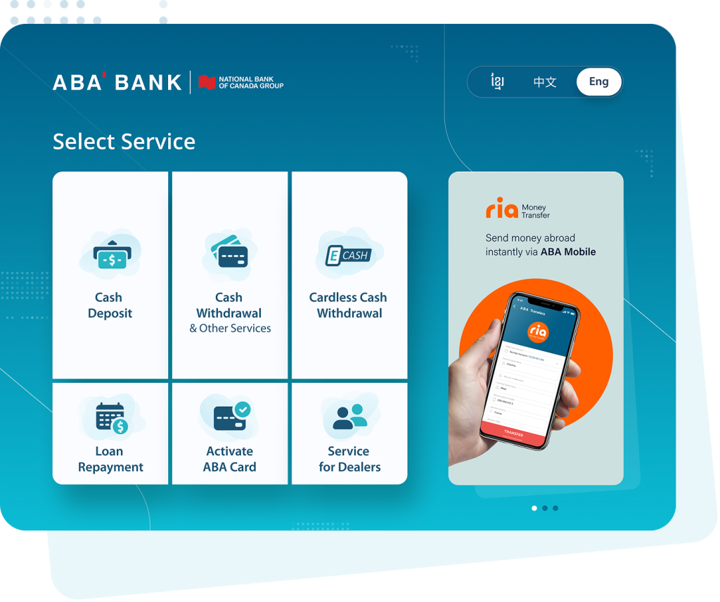
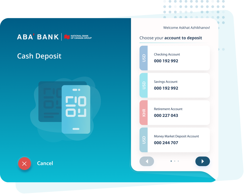
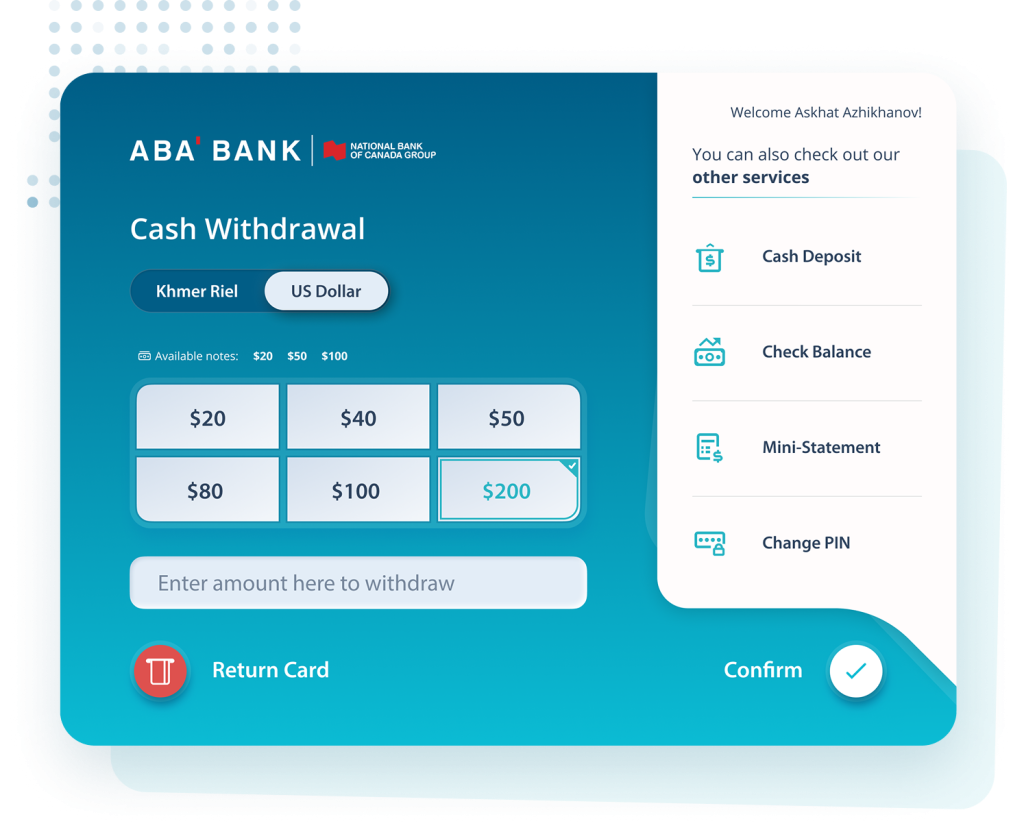
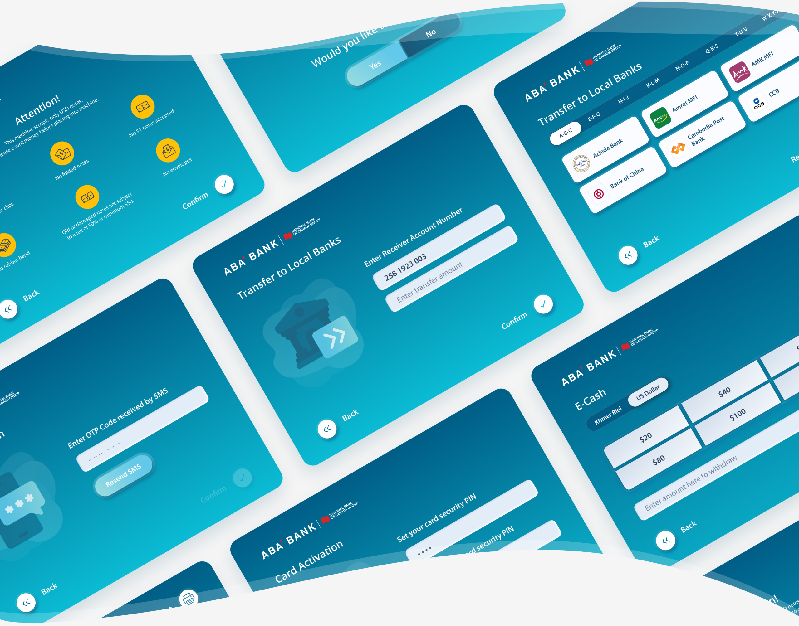
Traditional ATM interfaces are often outdated, visually cluttered, and difficult to navigate, especially for users unfamiliar with digital banking flows. Customers interacting with ABA Bank ATMs needed a clearer, faster, and more intuitive experience for essential transactions such as deposits, withdrawals, and transfers.


The existing experience did not fully leverage modern UI principles, clear service categorization, or visual guidance, resulting in slower task completion and potential user hesitation at critical transaction moments.

Goal

  • Improve usability of core ATM flows
  • Simplify access to high-frequency services
  • Modernize UI design and visual system
  • Reduce cognitive load during financial transactions
  • Create a scalable UI kit for future ATM features

Responsibilities

  • Defined main flows to reduce friction and hesitation.
  • Organized services into clear, high-priority categories on the main screen

  • Developed a cohesive UI kit for ATM screens

  • Worked with stakeholders and technical teams to align interface design with ATM hardware constraints.

User Research and Observations

Line 1

Research and analysis focused on understanding how users interact with physical ATM interfaces in real-world contexts. Unlike mobile apps, ATM usage happens in public, time-sensitive environments where clarity and speed are critical.

1.

Users want to complete transactions quickly with minimal decision-making.

2.

Clear categorization of services reduces hesitation.

3.

Visual hierarchy and icon recognition are critical in physical interfaces.

4.

Users feel anxious during financial transactions; clarity builds trust.

ATM designs

Line 1
Stand By icon

Stand by Screen

From the Stand by Screen, the user can easily navigate through different ATM services and solve their needs in a few simple clicks, thanks to an awesome design.

Cash deposit icon

Cash Deposit

According to the Bank data, common users have more than 5 accounts in different currencies, which is why we tried to make the cash deposit flow understandable and easy to use for other users.

Cash withdrawal

Cash Withdraw

From the Cash Withdrawal screen user can withdraw cash in different currencies and also navigate to other accompanying ATM sections

icons_transf other bank

Transfer to Local Banks

With an improved interface user can make a cash transfer to a different bank in Cambodia with fa ew easy steps.

Service icons

Custom pixel-perfect icons for all ATM services

Outcome and learnings

Outcome

The redesigned ABA Bank ATM experience delivered a modern, intuitive, and visually cohesive interface that improved clarity across all primary transactions. Users were able to complete withdrawals, deposits, and transfers with greater speed and confidence. The introduction of a structured UI system and custom iconography enhanced recognition, reduced hesitation, and supported scalability for future services.

What we learned

  • ATM experiences must prioritize clarity over feature density

  • Visual hierarchy directly impacts user confidence

  • Icon systems significantly improve service discoverability

  • Financial interfaces must reduce anxiety through simplicity

  • Public, time-sensitive environments require ultra-clear UX