docs 2.0

About the project

Line 1

The Workato Docs website is the official documentation portal for the Workato platform. It offers detailed guides, references, and documentation. It helps users navigate the platform effectively, enabling them to streamline automation and integrate business processes seamlessly.

Problem

Line 1

The existing Workato documentation experience was difficult to navigate and inefficient for users trying to learn or implement platform features. Content was fragmented, feature discovery was poor, and the overall UI did not support fast scanning or exploration. Users struggled to find relevant documentation quickly, especially when they didn’t know the exact feature name or entry point.


As a result, documentation became a friction point instead of an enablement tool, slowing down onboarding, learning, and implementation.

Goal

  • Make documentation easier to navigate and consume
  • Help users find relevant docs without deep prior knowledge
  • Create a modern, clear, and structured documentation experience

Responsibilities

  • Create new information architecture for Workato Docs 2.0

  • Design the new documentation homepage and navigation system

  • Improv article page usability and readability

Research

Line 1

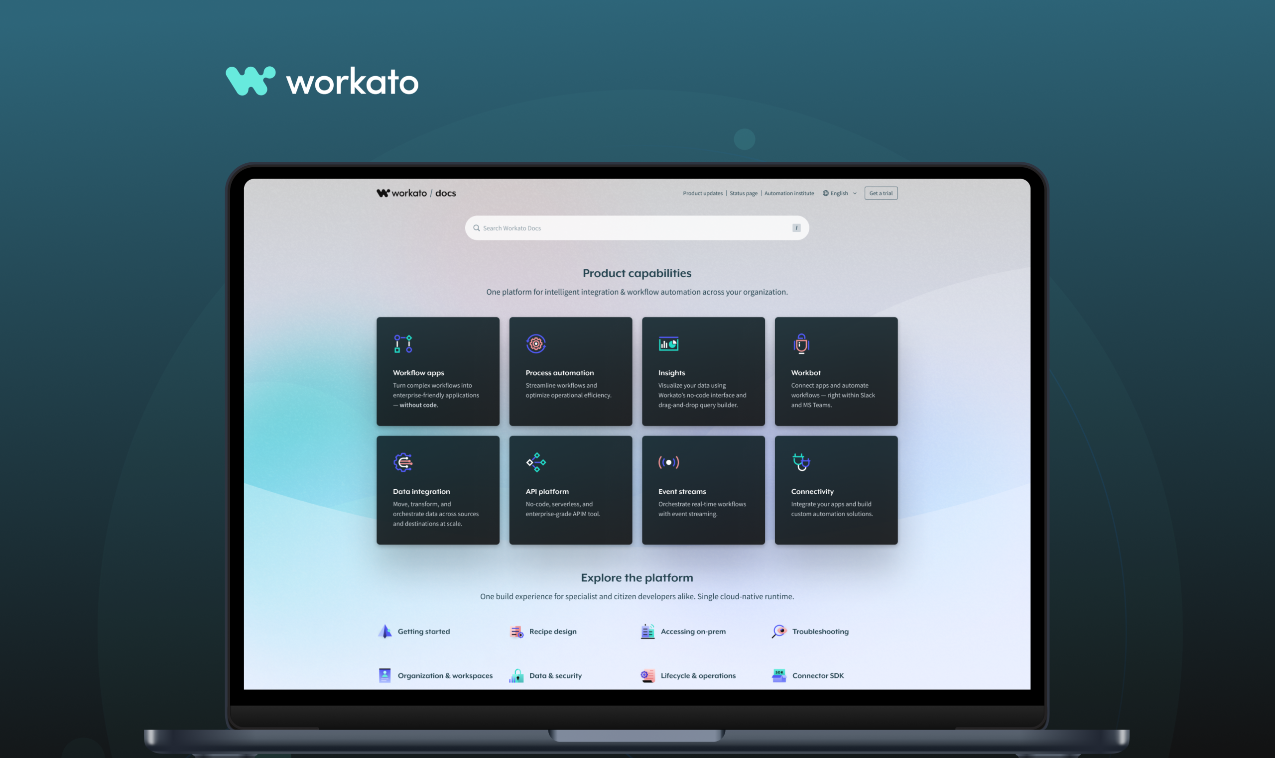
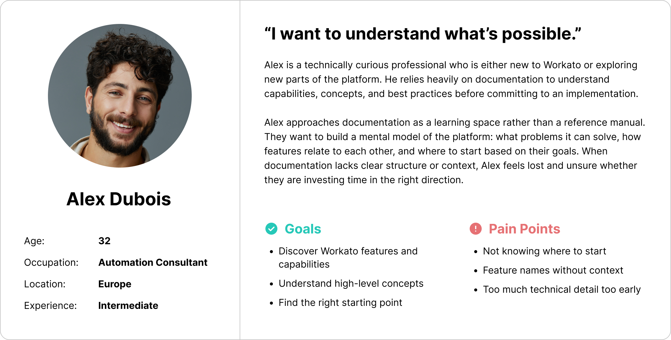
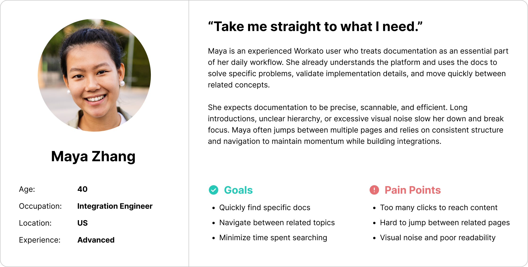
Research insights (implicit from the redesign decisions) showed that users approached documentation with different intents: some were exploring what Workato could do, while others were searching for precise implementation details.

Users needed a documentation experience that supported fast scanning and orientation, clear categorization of content, easy movement between conceptual, how-to, and reference materials.

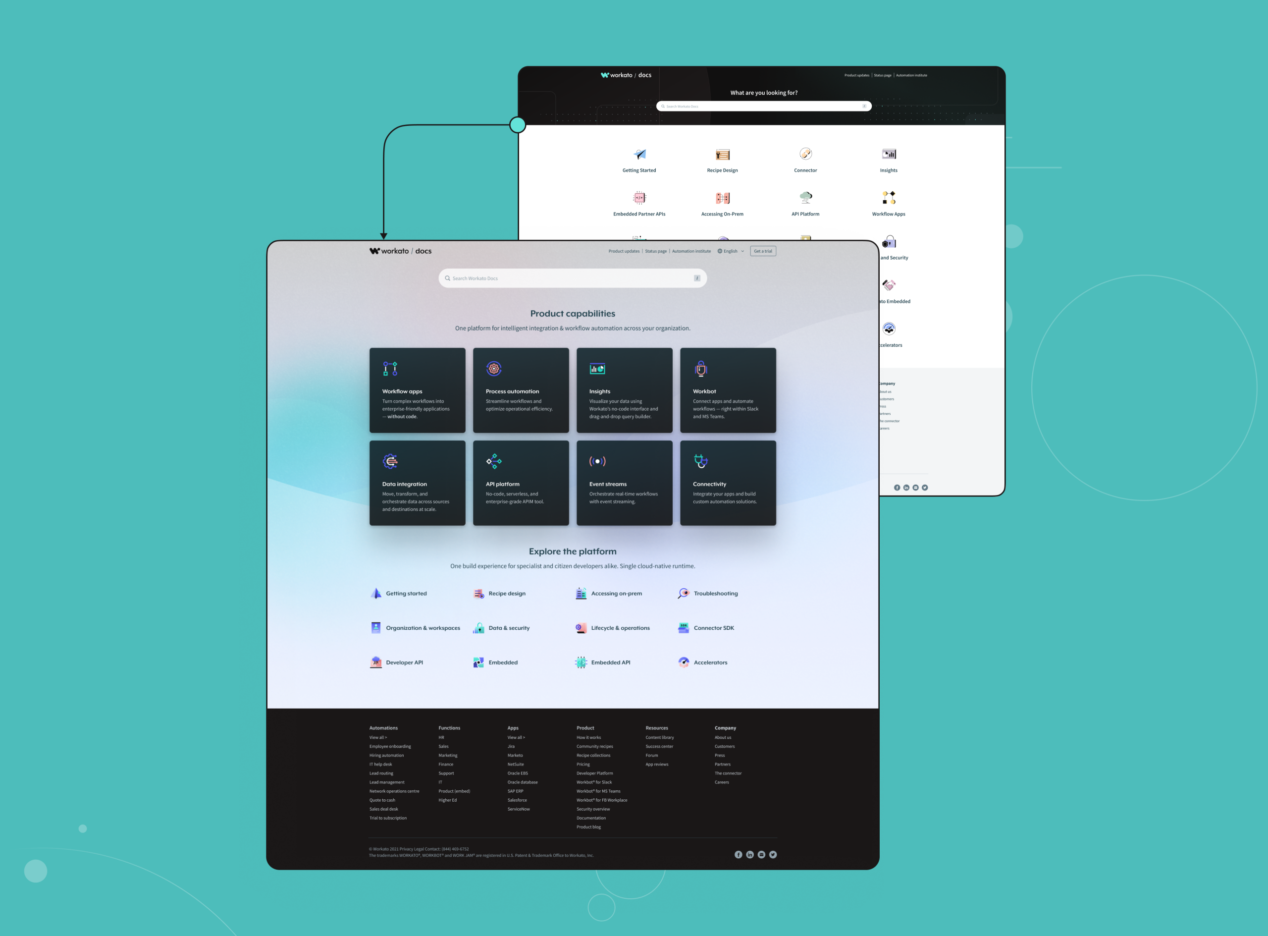
The lack of a strong entry point and unclear hierarchy made it hard for users to understand where to start and how topics related to each other.

Pain Points

Line 1

1.

Poor discoverability of features and documentation

Users had difficulty finding relevant docs unless they already knew exactly what they were looking for.

2.

Unclear information hierarchy

Content was not structured in a way that supported scanning, exploration, or learning paths.

3.

Outdated and inconsistent UI

The visual design did not support readability, clarity, or modern documentation expectations.

User personas

Line 1

Design & UX Solutions

Line 1

We conducted multiple usability studies to validate the shift from app-first to solution-first discovery, including discovery flow testing, information architecture validation, comparative usability testing, and confidence-based decision studies. The results showed reduced cognitive load, faster time to value, and higher user confidence, particularly for early-stage users exploring automation ideas.

1.

New Homepage as a Discovery Hub

The redesigned homepage acts as a clear entry point, helping users orient themselves and choose their path based on intent, exploration or execution.

2.

Category-Based Navigation

Documentation was grouped into clear categories, allowing users to browse by theme rather than guessing feature names.

3.

Visual System & Icons

Custom handcrafted icons were introduced to improve visual recognition, support faster scanning, and create consistency across categories

4.

Improved Article Layout

Article pages were redesigned to improve readability, content hierarchy, and navigation between sections.

New Homepage

Line 1

With the new approach, we prioritized showcasing the platform’s key capabilities upfront, while presenting other features in a less prominent way.

Homepage Categories

Line 1

The new homepage is structured into two sections: product capabilities and product explorations. Categories will dynamically shift between these sections based on the features we want to highlight.

Frame 21112

Article page

Line 1

The article page serves as a central hub for all documentation on a given topic. It includes cross-links for easy navigation, video tutorials, and other helpful features.

Group 26086195

Handcrafted icons

Line 1

The icons were completely redesigned while preserving their original concept to maintain user familiarity. We introduced a fresh, modern look while keeping the essence of the previous design.

Outcome & Learnings

Line 1

Outcome

Workato Docs 2.0 transformed documentation from a fragmented reference system into a structured, discoverable, and user-friendly knowledge hub. Users were able to find relevant content faster, understand platform capabilities more easily, and move between exploration and implementation with less friction.

What we learned

  • Documentation needs a strong entry point, not just search

  • Clear categorization is critical for discovery

  • Visual systems (icons, layout) significantly improve scanability

  • Docs must support both learning and doing

  • Usability matters as much in docs as in core product UX

Project team

Line 1
Design director
Ivan Valiukh
UX/UI Designer
Bochuan Li
Project Manager
Grace Ng